
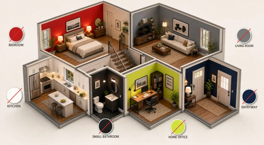

Most paint regret comes from the room, not the color. The colors to avoid depend on the space: skip saturated red and bright yellow in bedrooms, red and stark white in kitchens, black and dark brown in small bathrooms, and cool gray in living rooms. Below you get a room-by-room table, safer swaps, and a simple test for 2027’s trending paint colors.
Paint regret is common, and it usually shows up the first night the lamps go on. At Potala Store, we sell Tibetan thangka paintings and prayer flags, art built on saturated red, gold, and green. That is why this guide leans on one idea: keep walls calm and move bold color to pieces you can swap. Every number below comes from a named source, and we flag the weak ones.
Important note: Color psychology findings, sleep surveys, and feng shui ideas in this guide reflect design opinion, survey data, or traditional belief. They are not medical advice, and they do not replace guidance from a health professional.
Table of Contents
What Colors Should You Avoid in Each Room? (2027 Quick Answer)
Avoid saturated red, orange, and bright yellow in bedrooms; red and stark white in kitchens; black, dark brown, and stark cool white in small bathrooms; cool gray or greige in living rooms; and bright red or neon in home offices. Each shade has a safer swap, and none of them is banned outright.
| Room | Avoid | Why | Try Instead |
|---|---|---|---|
| Bedroom | Saturated red, orange, bright yellow | Reads energizing, not restful | Muted sage, soft blue-gray, warm off-white |
| Living room | Cool gray, greige | Looks flat under lamps | Creamy white, warm taupe |
| Dining room | Full-wall bright red | Overwhelms a smaller room | Red above the chair rail only |
| Kitchen | Red, stark white | Loud or lifeless | Warm cream, soft sage |
| Small bathroom | Black, dark brown, stark cool white | Absorbs light or feels clinical | Warm white, pale green |
| Home office | Bright red, neon, plain white | Distracting or sterile on camera | Matte mid-tone warm neutral, soft green |
| Entryway | Deep full-wall color, no window | Absorbs light, feels closed in | Light warm neutral, color on art |
Planning a bedroom refresh? Read our guide to feng shui bedroom colors for better sleep before you open the paint can.
Why Is a Color Fine in One Room and Wrong in Another?
Three variables decide most regrets: saturation, natural light, and room size. Saturation is how much chroma a shade carries, so a muted red behaves very differently from a pure one.
A north-facing room tends to pull colors cooler and flatter, while warm lamps add yellow after dark. Dark or intense shades also close in small rooms, because walls take up more of what you see.
What Is LRV, and Why Does It Matter for Dark Colors?
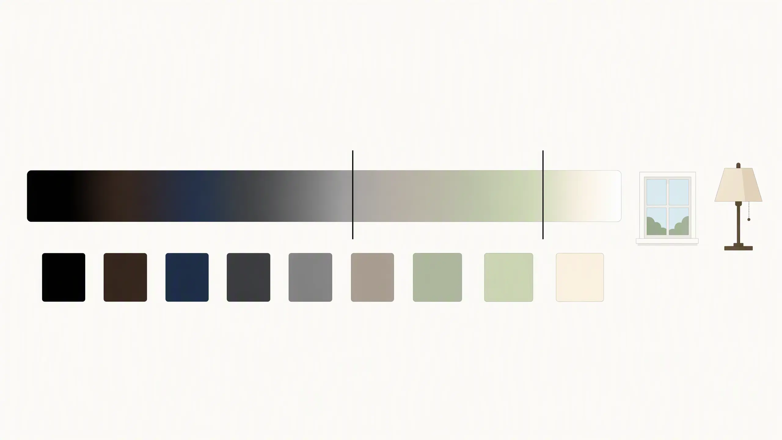
Light reflectance value (LRV) rates how much light a paint reflects, from 0 for black to 100 for pure white. Paints below 50 absorb more light than they reflect, according to Diamond Vogel’s LRV guide.
That matters most in windowless rooms, where dark walls leave little light to bounce. Check the LRV on the paint chip before you buy a gallon.
Bedroom Colors That Can Work Against Sleep
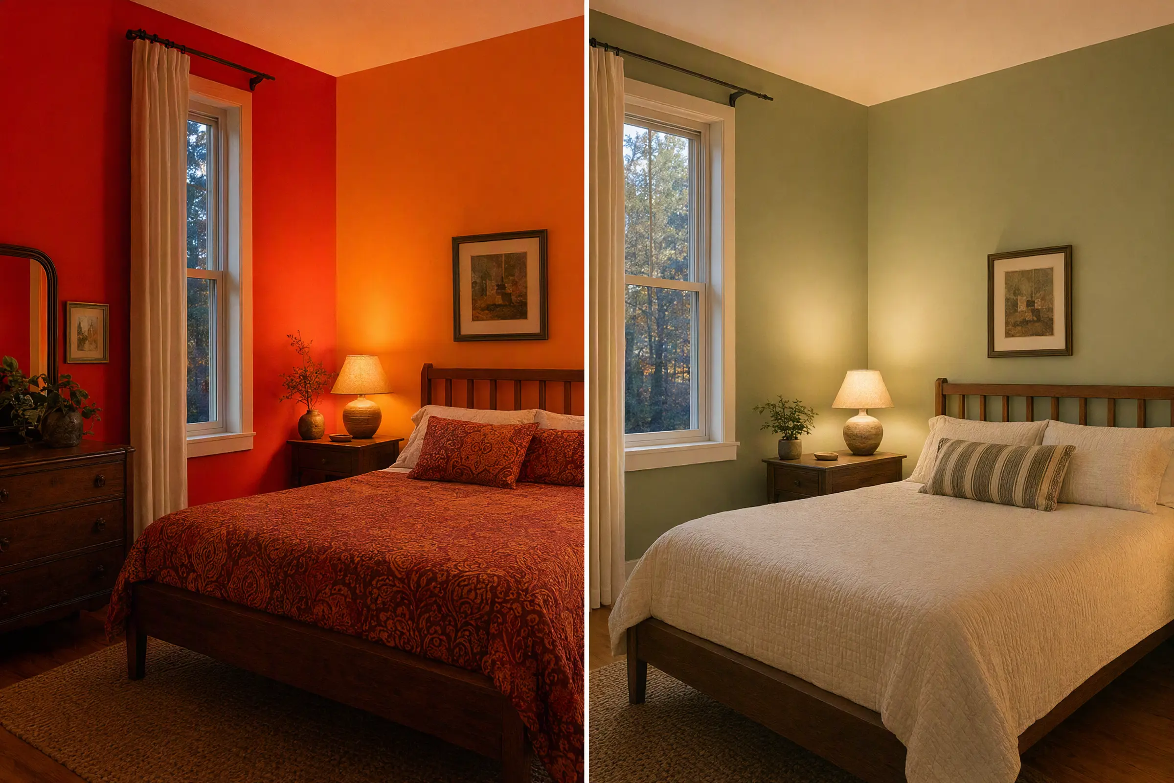
Saturated red, orange, and bright yellow are the bedroom colors designers avoid most, because they read as energizing rather than restful. Muted, pastel versions of the same hues are usually fine, and warm bulbs at 2700K or lower keep any bedroom color calm after dark.
What Colors Prevent Sleep?
Hard evidence that a wall color prevents sleep is thin, but designers agree on which hues feel energizing. Designer Marie Flanigan told Livingetc she leaves reds, oranges, and yellows out of bedrooms. HGTV’s designer roundup adds more shades to skip:
- Saturated red: reads loud at bedtime.
- Flamingo pink and wine red: strong chroma, even in a soft hue family.
- Bright yellow: bright and stimulating.
- Acid green and Kelly green: too vivid for a resting space.
If you love red, keep it to a throw or a headboard you can swap.
Why Can Stark White and Cool Gray Backfire at Night?
HGTV’s roundup also lists cement gray and bright white among bedroom shades to skip, because they can feel clinical after dark. Bedroom colors and bulbs work as a pair: warm 2700K light shifts a cool gray toward yellow, which can look muddy.
The bulb itself matters too. A 2018 study in Physiological Reports tested 22 children and 20 adults under 3000K and 6200K LED light at night. The 6200K light suppressed more melatonin, the hormone that signals bedtime, in children but not in adults. Lighting guides, including one from Lumens, suggest evening bulbs at or below 2700K.
Is Blue Good or Bad for a Bedroom? Sleep Surveys vs. Feng Shui
A 2013 Travelodge survey of 2,000 UK homes found blue bedrooms averaged 7 hours 52 minutes of sleep. Yellow averaged 7:40, green 7:36, and purple only 5:56. Treat this as a clue, not proof: a hotel chain ran it, people self-reported, and it shows correlation only.
Feng shui, a traditional practice rather than a tested one, links deep blue and black to the Water element and suggests keeping them light in bedrooms. The two views meet in the middle. Choose soft, gray-toned blues for walls, and use navy or black as small accents.
Living Room and Dining Room Shades That Fall Flat
Cool gray and greige top designers’ living room regret lists because they can look flat once furniture and lamps are in place, while full-wall bright red can overwhelm a smaller dining room.
Why Do Cool Gray and Greige Feel Dated Heading Into 2027?
Designers quoted in an AOL roundup of living room regrets point to flat, cool grays. Porch Daydreamer’s review of Sherwin-Williams’ 2027 forecast notes a drift toward warmer, deeper earthy neutrals.
Creamy white and warm taupe give you the same calm without the chill. If you are not ready to repaint, an accent wall in a warm neutral is a lower-risk first step.
Is Red a Mistake in a Living Room, or Perfect for a Dining Room?
Red is risky in a living room but workable in a dining room if you limit it. SheKnows notes that red and orange are often believed to stimulate appetite, which suits a table. Bright red on every wall still overwhelms a small room.
One designer’s compromise is red above the chair rail, with a calmer shade below. Painting before Thanksgiving? Brush a red sample near the table and check it at dinner hour, under the lamps you will actually use.
Kitchen and Bathroom Paint Colors Designers Regret Most
In kitchens, designers split between red and stark white as the worst choice. In small bathrooms, black, dark brown, and stark cool white cause the most regret, because they either swallow light or make the room feel clinical.
Red vs. Stark White: Which Is the Worst Kitchen Color?
The Kitchn asked five designers for the worst kitchen paint color, and they split between these two.
| Color | Designer Complaint | Safer Move |
|---|---|---|
| Red | Overpowering; red cast can make green foods look less appetizing | Warm cream or soft sage |
| Stark white | Looks lifeless and cold | Warm white |
| Cool gray | Can feel institutional under kitchen lighting | Warm taupe |
Is It Okay to Paint a Small Bathroom Black or Dark Brown?
Dark paint can work in a powder room, but it is a poor fit for a small bathroom that needs to feel bright. Lauren Rasken told Homes & Gardens that stark, cool-toned whites are the worst choice for a small bathroom.
Black and dark brown sit near the bottom of the LRV scale, so in a windowless small bathroom they absorb most of the light a fixture provides. A deliberately dark powder room can still succeed with mirrors, warm bulbs, and a matte or satin finish.
Home Office and Entryway Colors That Undercut Focus and First Impressions
In a home office, bright red, bright yellow, and neon shades tend to distract, and Little Greene’s Ruth Mottershead even ranks white among the worst colors for a small office. In an entryway with no window, skip deep full-wall color.
Is White Bad for a Home Office?
White can be, when it is stark. Real Homes quotes Mottershead listing white among the worst small-office colors, because it can feel sterile beside a monitor. Hunker points to matte, mid-tone warm neutrals and soft greens as friendlier choices.
Your Zoom backdrop is part of the room, so a flat matte finish also helps by cutting glare from window light.
Should You Use Bright Red or Neon in a Home Office?
Use them sparingly. Homes & Gardens reports that red can become overstimulating in an office. Keep it to one accent wall or a desk accessory, and leave neon for small, swappable items.
What Entryway Colors Should You Skip?
Skip deep, dark full-wall color in a windowless entry. It absorbs light and makes the first six steps inside feel closed in. Use a light warm neutral on the walls and put bold color on art or textiles near the door.
Tibetan prayer flags do this well. They hang in a fixed order from left to right: blue, white, red, green, yellow, one for each of the five elements. Our guide to Tibetan prayer flag colors and their meanings explains each one.
2027 Color Trends: Which Colors to Avoid on Full Walls
There is no single 2027 Color of the Year: Sherwin-Williams picked Celery SW 6421, Behr chose Grounded, and Dutch Boy went with Deep Rooted, while Benjamin Moore and Pantone had not announced as of 10/09/2026.
What Is the 2027 Color of the Year?
Sherwin-Williams announced Celery SW 6421 on 09/15/2026. Its LRV is 71, so it is a light, airy green. Celery SW 6421 has a yellow undertone that can shift in a north-facing room, so sample it on two walls. One affiliated page tags it cool-toned while the press release mentions subtle yellow undertones, which is one more reason to test.
Other brands have named their own picks:
- Behr: Grounded, a mossy olive green.
- Dutch Boy: Deep Rooted, a sun-baked orange.
- Glidden: Artifact.
- Valspar: Cottage Door.
- Dunn-Edwards: French Press Coffee.
Last year, Benjamin Moore announced on 10/16/2025 and Pantone on 12/04/2025, so we will update this page after both. Here is our judgment on where the announced colors fit, not a brand rule:
| Trend Color | Better Fit | Use Sparingly In |
|---|---|---|
| Celery SW 6421 | Rooms with steady daylight | North-facing rooms, until sampled |
| Grounded | Living rooms and studies with daylight | Small windowless baths and entries |
| Deep Rooted | Accent wall, door, decor | Full-wall bedrooms |
| French Press Coffee | Dining rooms, reading nooks | Small bathrooms |
How Do You Test a Trend Color Before You Commit?
- Check the LRV: a number near 70 reads bright, and below 50 reads dark.
- Paint two large samples: put them on walls with different exposure, each at least 2 feet square.
- Watch for 48 hours: look at midday and again under your 2700K lamps.
- Hold it against your floor, wood, and fabrics: trend colors often clash with what you already own.
Do this the weekend before Thanksgiving, not the night before.
Can You Add Bold Color Through Decor Instead of Walls?
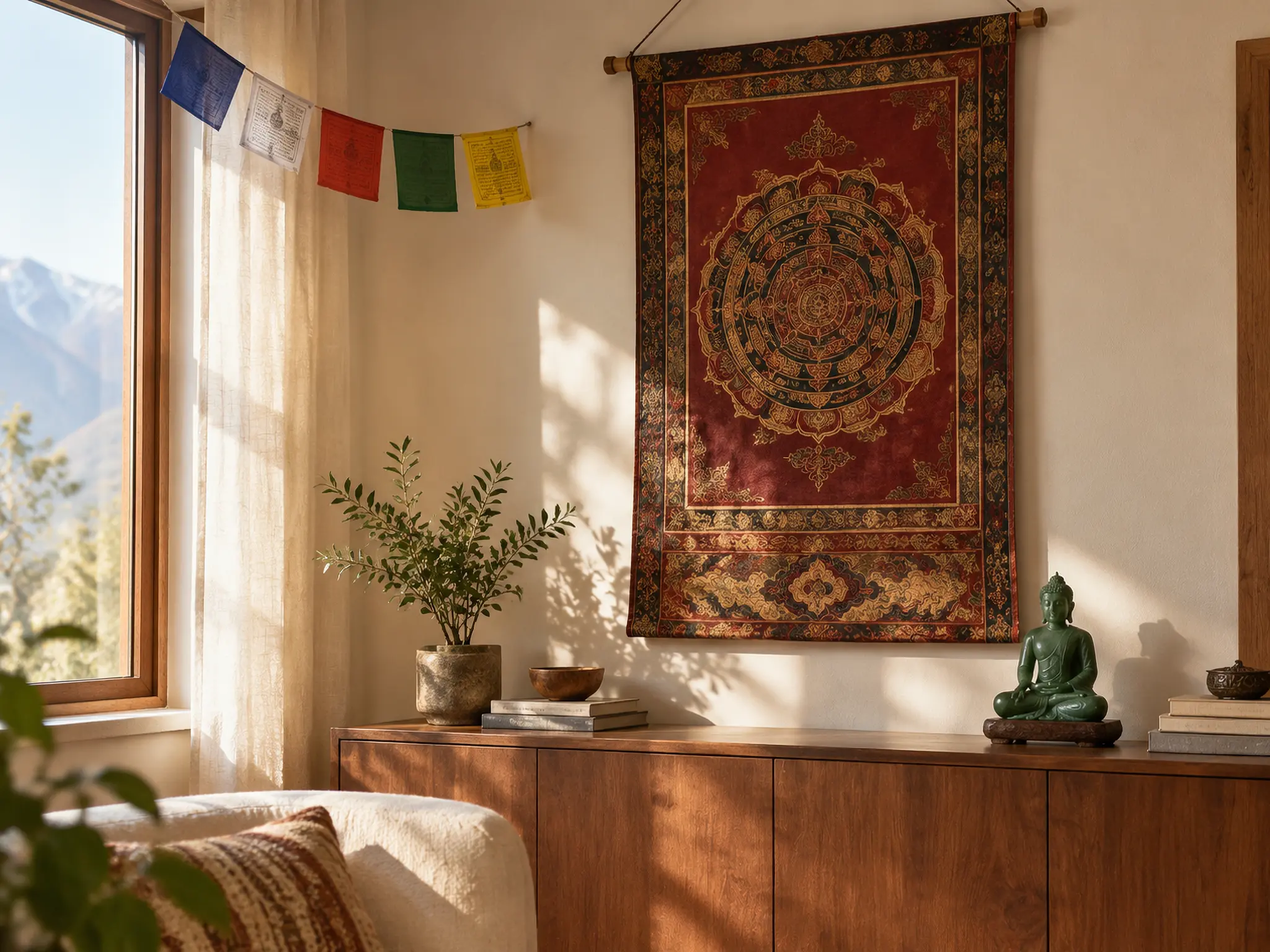
Yes, and it is the lowest-risk way to follow a trend. Thangka paintings are hand-painted Tibetan scrolls, devotional art that carries saturated reds and golds. Hung on a calm wall, a thangka brings that color into the room without a gallon of paint, and you can move it when your taste changes.
A small green sandstone Buddha statue echoes the 2027 green trend on a shelf, so you can follow Celery without a full wall. Traditionally, thangka and statues are treated as sacred art, so give them a clean, raised spot.
Love bold red or gold but not on your walls? Bring it in through hand-painted Tibetan thangka paintings from Potala Store.
In summary, the safest way to handle colors to avoid in each room is to match the shade to the room’s light, size, and job. Test every trend color in your own light, and keep walls calm.
Let color live where you can change it. Browse Potala Store’s collection of Tibetan home decor and spiritual art and add color without repainting.Shop Tibetan home decor
Frequently Asked Questions
Feng shui traditionally links each color to one of five elements, and many practitioners suggest keeping deep blue and black, the Water colors, light in bedrooms. Treat it as a cultural lens, not a tested rule. Use it to break a tie after you have sampled colors in your own light.
Color drenching paints walls, trim, and often the ceiling in one color. It works in rooms with strong daylight, but a dark drench in a small windowless room leaves little light to bounce. Check the LRV first, then sample for 48 hours before you commit.
No. LRV measures how much light a color reflects, not how white it looks. Celery SW 6421 is a green with an LRV of 71, so check the undertone as well as the number.
📚 References
- 2027 Color of the Year, Celery SW 6421: official announcement and color data. Sherwin-Williams
- Melatonin suppression in children under blue-enriched LED lighting at night: peer-reviewed study comparing 3000K and 6200K light. NIH PubMed Central
- What is LRV? Plain-language explanation of light reflectance value and the 0 to 100 scale. Diamond Vogel
- Kelvin Color Temperature Chart: guide to choosing bulb color temperature by room. Lumens